Introduction to Good Website Design
On the digital stage, your website is your company’s frontman. It communicates who you are, what you do, and most importantly – why visitors should choose you over competitors.
Importance of Good Website Design
Good website design is crucial; it’s no longer just an accessory but a vital part of any online strategy. It enhances brand image, cultivates trust, and serves as a virtual salesman. A well-designed website:
• Attracts visitors
• Keeps them engaged
• Encourages interaction
• Facilitates conversions
Role of Website Design in User Experience
Beyond aesthetics, website design profoundly impacts user experience. It determines how easily visitors can navigate your site, find information, and complete tasks. A carefully crafted design allows for an intuitive, seamless user journey, fostering customer satisfaction and loyalty.
Principles of Good Website Design
Designing a website might seem challenging, especially without a comprehensive understanding of its underlying principles. Here are four main principles essential to crafting an appealing and user-friendly website.
1. Simplicity and Minimalism in Design
Remember, less is more in website design. Avoid unnecessary clutter on your web pages. Use simple, clean lines and colors, and minimize the use of text where visuals can communicate effectively. The goal is to make navigation and comprehension as intuitive and easy as possible for the user.
2. Consistency in Design Elements
Consistency elevates the user experience by maintaining a uniform theme and design across your entire website. Having similar layouts, fonts, and colors across all pages makes your website look professional, contributes to brand recognition, and allows users to navigate more intuitively.
3. Visual Hierarchy and Readability
It’s essential to prioritize your information effectively to direct user attention. Use size, contrast, color, and spacing effectively to create a visual hierarchy and improve readability.
– Bulleted lists
– Short paragraphs
– Clear, concise text
All these tools can significantly enhance the legibility of your content.
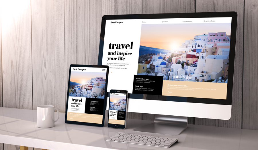
4. Mobile Responsiveness and Adaptive Design
With the increasing use of mobile devices for accessing the web, ensuring your website is mobile responsive is indispensable. Responsive design makes your website look and function well on all devices, sizes, and orientations, thus enhancing the user experience significantly. Adaptive design, on the other hand, involves designing different layouts for different devices, offering more control over design and performance.
User-Friendly Navigation Design
Any professional designer will tell you that one of the essential principles of good website design is impeccable navigation. Without an intuitive, easy-to-understand layout, your visitors will quickly become confused or frustrated and leave your site, which is definitely not the goal! Let’s explore some crucial aspects of this principle.
1. Importance of intuitive navigation
When it comes to creating a user-friendly website, intuitive navigation design is key. A design that guides the visitor, almost unconsciously, through your site makes their journey enjoyable and easy. It helps them find what they’re looking for in less time, leading to greater user satisfaction and, ultimately, higher conversion rates.
2. Clear and organized menu structure
The menu structure of your site should be well-organized and clear. Dropdowns and submenus can be used, but they shouldn’t be too complex or overwhelming. Group similar pages under a single menu category, keep the headings short and specific, and remember to declutter regularly.
3. Effective use of navigation bars and buttons
Always make sure that navigation bars and buttons are easily identifiable and consistently placed across your site. For instance, having a “Home” button or logo in the top left corner is a commonly adopted practice. Try to use conventional symbols—think hamburger icons, arrows, and such—that people are already familiar with.
4. Incorporating search functionality
Finally, don’t underestimate the power of a simple search box. Especially on a high-content site, advanced search functionality is a must-have feature that speeds up the navigation process significantly, boosting the user experience by enabling folks to skip right to the information they need.
Responsive Design for Different Devices
The need for the web to be responsive isn’t just a trend, it’s an essential principle for good website design. Creating a responsive website ensures you’re delivering an optimal user experience across all platforms.
1. Understanding responsive design
Responsive design refers to a site’s ability to adjust and adapt itself according to the device’s screen size and orientation. With the diversity of devices people use to access the internet today – smartphones, tablets, laptops, and desktops – it is crucial that your website is designed to cater to these various screen dimensions for an improved user experience.
2. Designing for mobile devices
– Keep your site simple and clean: Streamline information and prioritize content that is most beneficial to mobile users.
– Easy navigation: Ensure your menu is easy to use so users can find what they need quickly.
– Touch-friendly: Create large, easy-to-touch elements to improve accessibility.
3. Designing for tablets
Designing for tablets is a little different than mobile devices as the screens are larger and users can see more detailed features. Utilize the following strategies:
– Optimise for landscape and portrait modes.
– Incorporate responsive images and graphics that scale correctly.
– Keep the navigation menu visible and easy to use.
4. Ensuring compatibility across different browsers
Your website should work seamlessly whether your visitors are using Chrome, Firefox, Safari, or even Internet Explorer. To ensure your website is compatible across different browsers,
– Follow standards-compliant coding.
– Regularly test your website on different browsers to spot any inconsistencies or issues.
Follow these principles to ensure your website design is responsive, functional and user-friendly.
Importance of Color Theory in Web Design
Color theory is one of the foundational concepts in web design. The choice of colors significantly influences viewers’ perception and response to a website. Let’s understand the role of colors in website design and the ways to leverage them effectively.
1. Understanding colors and their psychological impact
Every color triggers a particular emotional response. For instance, red incites excitement and passion, blue delivers a sense of calm and trust, while green induces relaxation and growth. A thorough comprehension of color psychology can help designers create sites that appropriately resonate with their target audience.
2. Choosing a color palette that aligns with brand identity
Your color palette should be in harmony with your brand’s personality. For a corporate firm, a palette of blues and grays might be suitable; an organic food store might opt for greens and browns. Always ensure that your color choices accentuate your brand identity instead of overshadowing it.
3. Using colors to create visual interest and hierarchy
Colors can also guide users’ attention towards specific information or call-to-action buttons on your site. Darker colors for headers and bright hues for important action points can create a visual journey, enhancing user engagement.
4. Avoiding color overload and maintaining balance
Although colors add vibrancy, overuse can lead to visual clutter. Maintaining a balance – perhaps, via the 60-30-10 rule (60% dominant color, 30% secondary color, and 10% accent color) – can result in an attractive yet clean layout. Remember, less is often more when it comes to color application in website design.
Incorporating User-Centered Design
Understanding what your user needs and expects from your website is the cornerstone of user-centered design. This approach prioritizes the goals, preferences, and behaviors of your end user, helping create more engaging web experiences.
1. Conducting user research and usability testing
To create a user-centered website design, you must first conduct thorough user research and usability testing. Use surveys, interviews, and user testing sessions to collect insights and identify patterns about behaviors, needs, and motivations. Pay special attention to:
– Common tasks users perform on your website.
– Challenges they face during navigation.
– Features or information they value.
2. Incorporating user feedback into design decisions
User feedback is indispensable for refining your website design. It reveals what’s working and what’s not. Regularly collect user feedback through reviews, comments, or direct conversations, and use this information to make informed design decisions.
3. Designing for accessibility and inclusivity
An inclusive design ensures your website is accessible to everyone, including people with disabilities. Don’t forget to:
– Use readable font sizes.
– Provide alternative text for images.
– Ensure functionality for keyboard-only users.
– Check color contrast for visual accessibility.
4. Ensuring efficient loading times and optimized performance
Slow-loading websites can frustrate users and increase bounce rates. Ensuring fast loading times and optimized performance is crucial. Consider:
– Optimizing images and videos for quicker load times.
– Reducing the use of heavy scripts or unnecessary plugins.
– Implementing server caching for repeated visits.
Optimizing Images and Media for Websites
A good website is often defined not just by its written content but also by the vibrancy and relevance of its images and media. Therefore, mastering how to optimize these elements will significantly enhance a website’s overall appeal.
1. Compressing and Optimizing Images
Images engage users and invite them to further explore your site. But, sizable images can slow down your website. Use online tools to compress and optimize images without reducing quality.
– Use free tools such as JPEG Optimizer or TinyPNG
– Keep an eye on the file size, aim for about 70-150kb per image
2. Proper File Formats for Different Types of Media
It’s crucial to understand the appropriate file formats. JPEG is the best format for realistic images and photos. PNG is ideal for icons, logos, and illustrations. GIFs are perfect for animations.
3. Ensuring Fast Loading Times for Multimedia Content
Slow loading times can deter users. Optimizing your multimedia content will help improve page load times.
– Uses a Content Delivery Network (CDN) to host your images and videos
– Implement lazy loading for your images
4. Incorporating ALT Text for Accessibility and SEO
Alt text isn’t just an essential element for accessibility. It also contributes to a site’s SEO strategy. It allows search engine crawlers to understand the image content, contributing significantly to your site’s discoverability. Always make it a habit to integrate it into your website design.
Creating Engaging and Effective Call-to-Actions
Call-to-Actions (CTAs) are an integral part of any website design. They guide your visitor’s journey, influencing them to take a specific action like signing up for a newsletter, making a purchase, or downloading a brochure.
1. Importance of Clear and Compelling CTAs
CTAs are more than just buttons or links — they’re a critical element of user experience. Clear, meaningful CTAs can guide users towards the desired action, reducing website bounce rates, and accelerating conversion rates. They provide direction and help visitors understand what action they’re expected to take.
2. Designing Attractive Buttons and Links
When designing CTA buttons and links, keep aesthetics and visibility in mind. Larger buttons tend to perform better as they’re easier to spot. But beware of obstructing content! Use contrasting colors from the color palette that complement the overall website design and don’t disturb the user experience.
3. Using Persuasive Language in CTAs
The power of language can’t be overlooked. Persuasive, action-oriented phrases (“Get started today!”, “Download now!”) compel users to act. Combine them with benefits (“Save time!”, “Improve productivity!”) for a potent mix.
4. Placing CTAs Strategically for Maximum Impact
Finally, strategic placement is key. Most effective spots include headers, right after product benefits, or at end of pages. Make sure CTAs aren’t cluttered together — give them proper space to shine. Stunning website design goes hand in hand with strategic CTA placement.
Testing and Iterating Design Elements
One of the most powerful tools in a web designer’s arsenal is continuous testing and iteration. It’s this ongoing tweaking and refining that gradually push your website from good to great.
1. Importance of Continuous Improvement in Web Design
Continuous improvement emphasizes the need to implement gradual, ongoing changes to ensure the end product remains relevant and appealing to the targeted audience. Regular updates and improvements to the design elements maintain the freshness of your site, optimizing user experience and enhancing the website’s overall performance.
2. Conducting A/B Testing for Design elements
A/B testing, or split testing, is a user experience research methodology. It involves showing two variants of a page to different halves of your users and examining which version performs better. Such testing may affect color schemes, font sizes, call-to-action buttons, images, or any other element.
3. Analyzing User Data to Inform Design Decisions
Analyzing user data helps you understand your audience better and design a website that caters to their needs and preferences. This involves studying site metrics, user behavior patterns, and more. Armed with these insights, you can make informed decisions when designing or adjusting elements on the site.
4. Incorporating Feedback for Iterative Design Improvements
Feedback plays a critical role in the iterative process. It brings valuable insights from a user’s perspective and helps identify issues that may not have been apparent during the design phase. Incorporating user feedback into every iteration ensures the website consistently catines improving and adapting to users’ needs and expectations.
Conclusion
1. Recap of essential principles of good website design
In summary, good website design revolves around several core principles. A clean, intuitive layout with effortless navigation is paramount. Optimize your site for mobile with responsive design, and always keep the user experience forefront in your mind. Make smart color choices using color theory, and don’t forget about the significance of well-placed, high quality stock photos.
2. Importance of ongoing maintenance and updates
Remember, excellent website design is not a “set it and forget it” undertaking. Regular maintenance and updates ensure your website remains secure, functional, and relevant. This includes everything from checking for broken links to adjusting to changes in search engine algorithms.
3. Encouraging continuous learning and experimentation in web design
In the ever-evolving world of digital design, you should never stop learning. Experiment with new strategies, keep up with trends, and never be afraid to revamp and rethink your website’s design. In this dynamic field, your willingness to learn and adapt can make the difference between a good website and a great one. Stay curious, fellow web designers!